

Work

2026

Escola Alemã Corcovado case cover: a close-up of the alumni landing page hero on a tablet, over a soft-lit blue background.

Escola Alemã Corcovado

  • UX/UI
  • Landing page
  • Design system

Once Corcovado, always Corcovado.

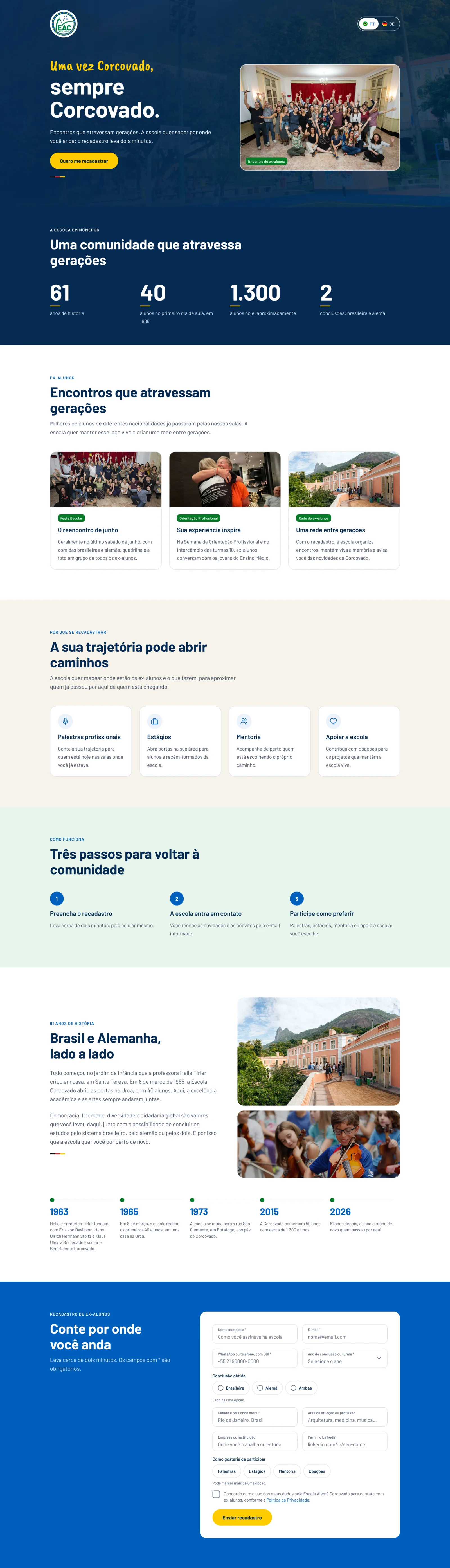
An alumni re-registration landing page for the school's 61st anniversary: mobile first, in Portuguese and German, with a two-minute form and a narrative built to spark pride in belonging.

Year
2026
Role
UX/UI Designer · research, visual direction, design system, layout, prototype and handoff
Studio
Estúdio Sync
Deliverables
Landing page on mobile and desktop, in Portuguese and German, a thank-you page, 8 form states, a clickable prototype and a design system

Context

Escola Alemã Corcovado, in Rio de Janeiro, is where two cultures meet: it offers both Brazilian and German diplomas and has a strong tradition in the arts. In 2026 it turns 61, with thousands of alumni across generations and nationalities. The school was launching a campaign to re-register them, and this landing page is where that campaign lands.

Challenge

Get people who left the school years, or decades, ago to stop scrolling on their phones and fill in a form. The brief asked for one feeling: pride in belonging. It was an invitation to reconnect, not a sale.

The page

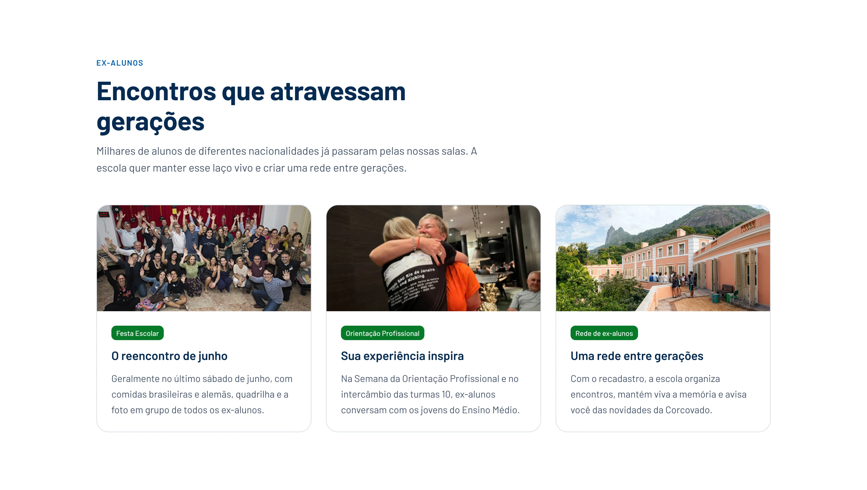
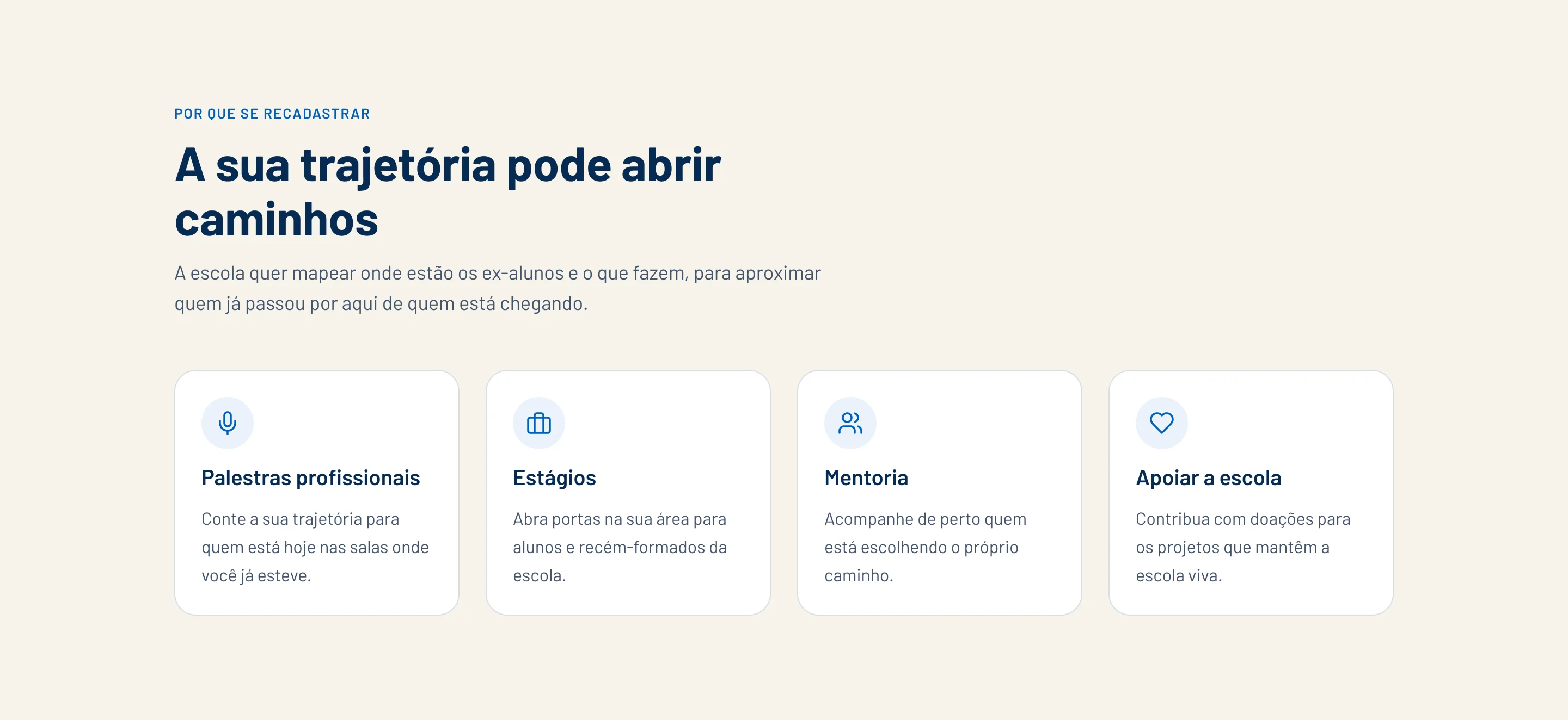
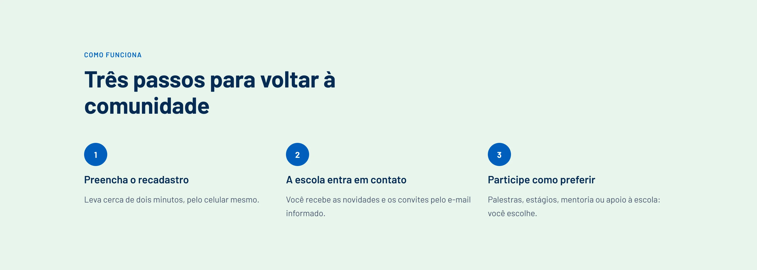
People up front, a short line on top, and yellow only on the button.

Structure

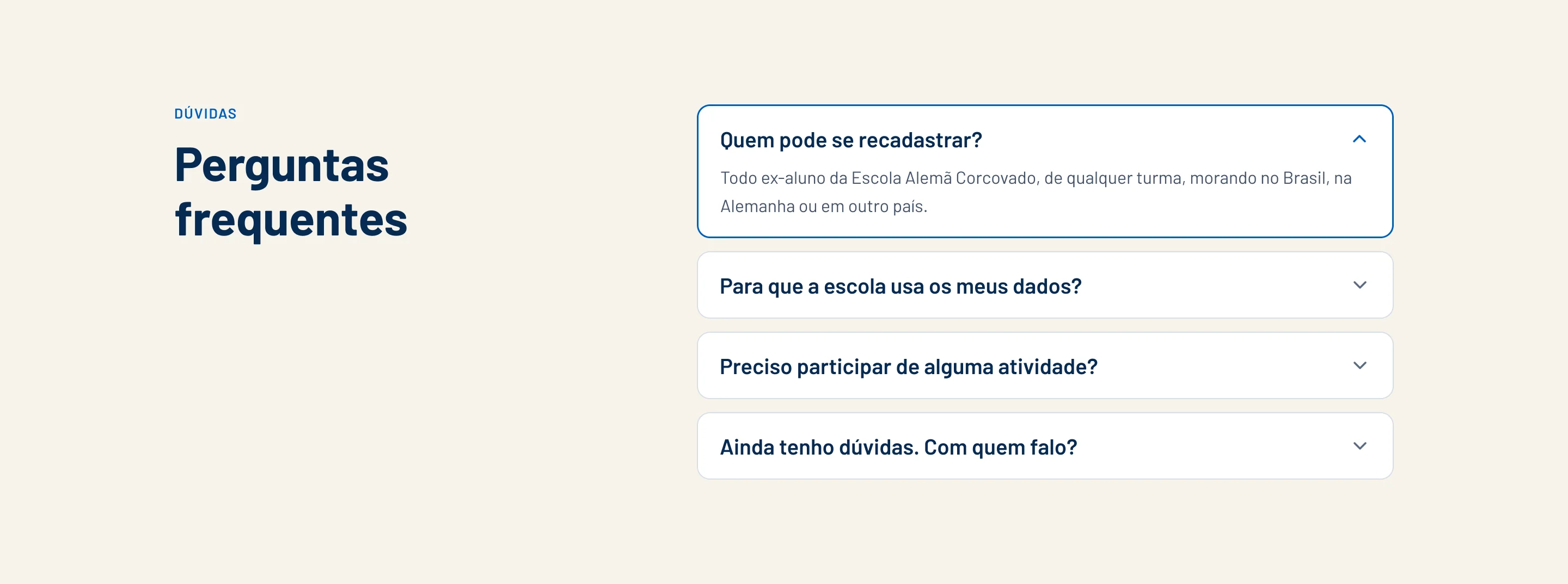
Eleven folds, one idea at a time

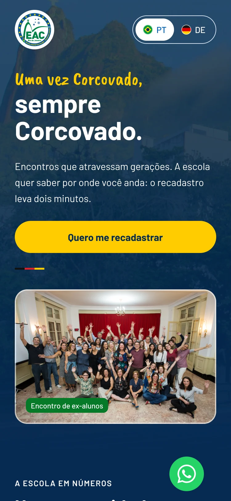
Hero

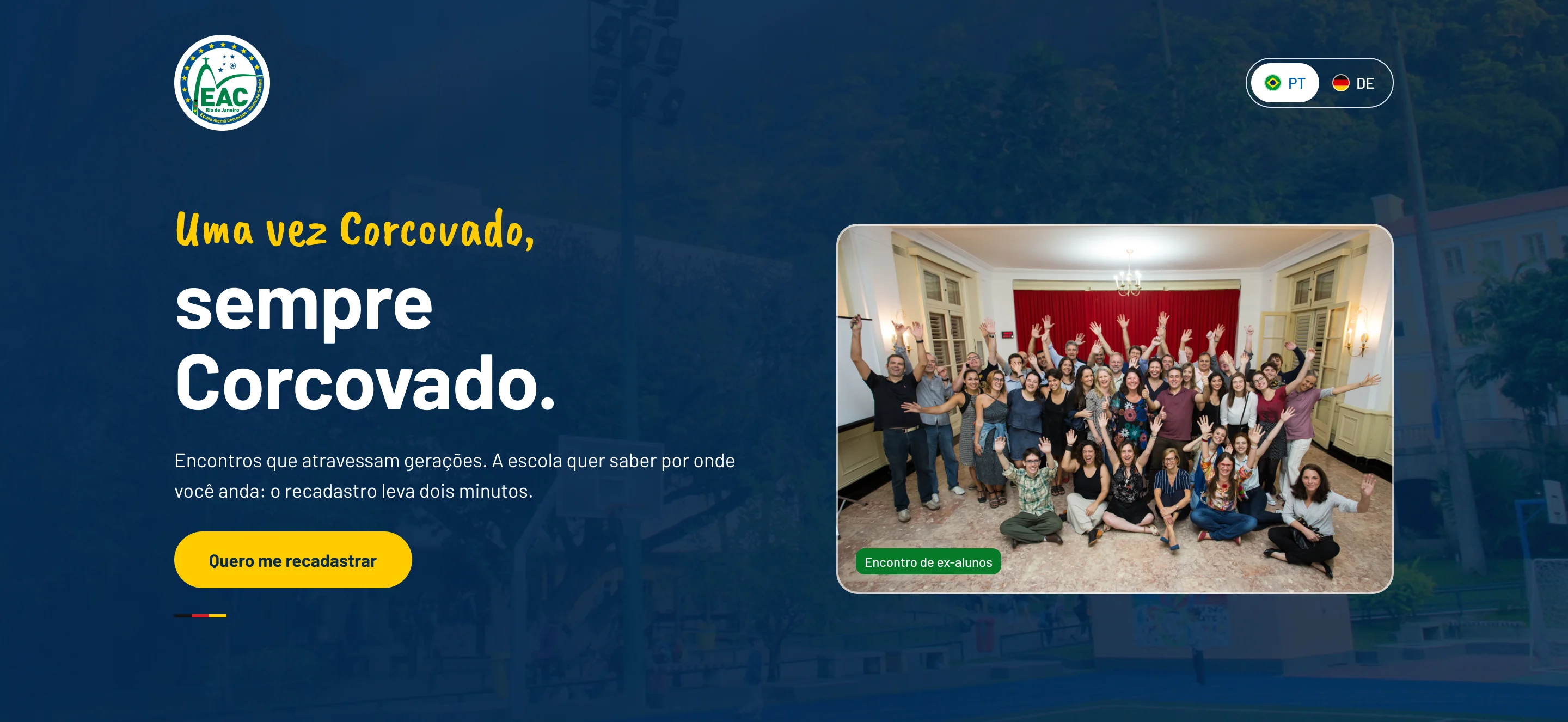
HeroA real alumni reunion and the campaign line.

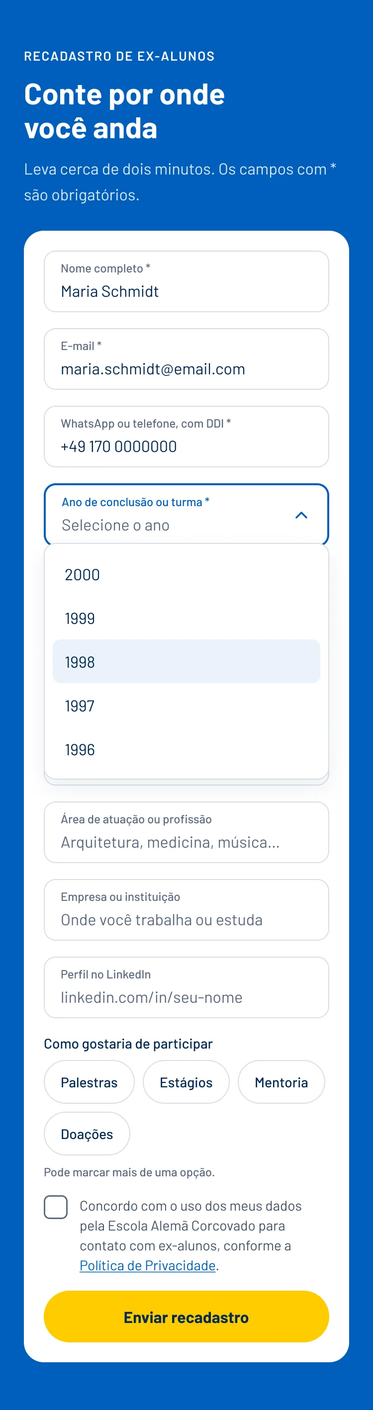
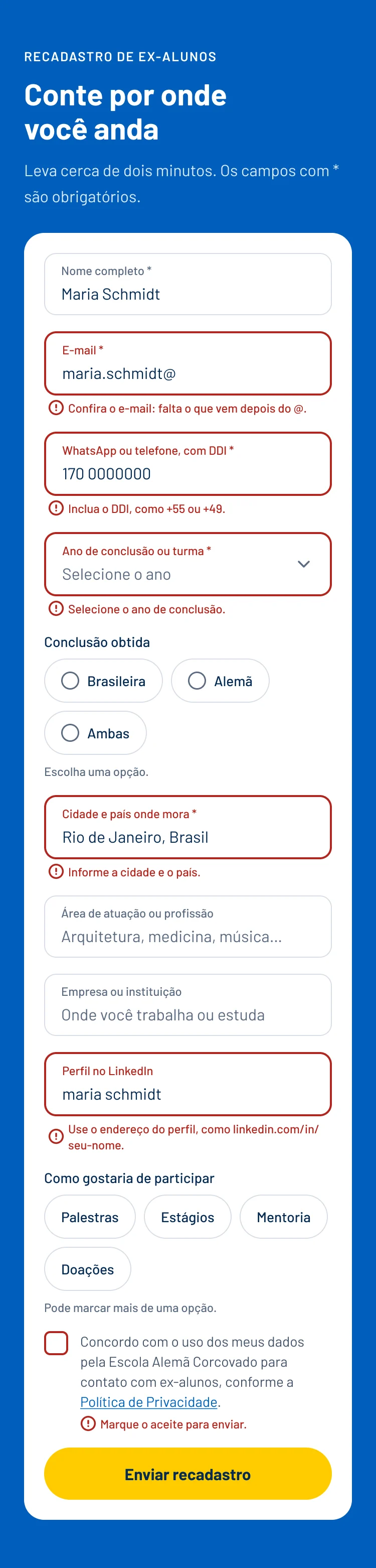
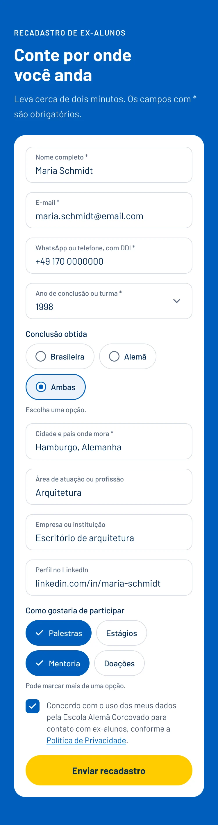
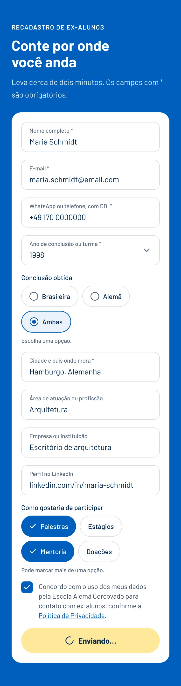
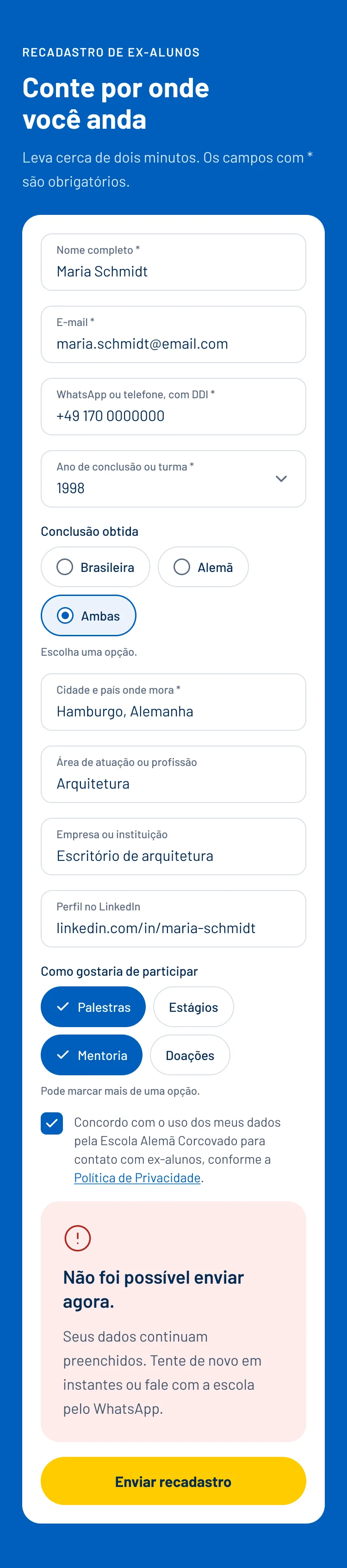
Form

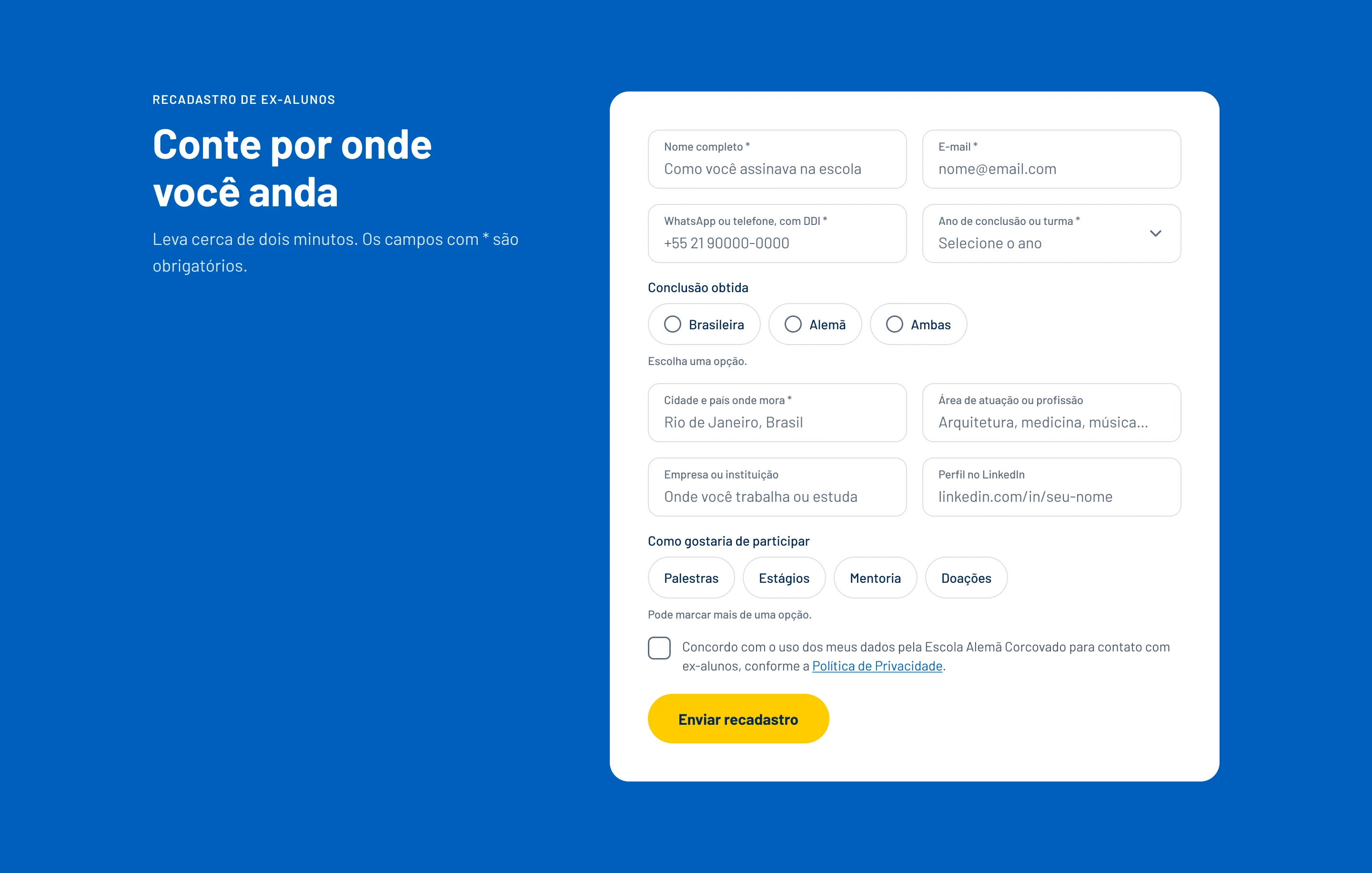
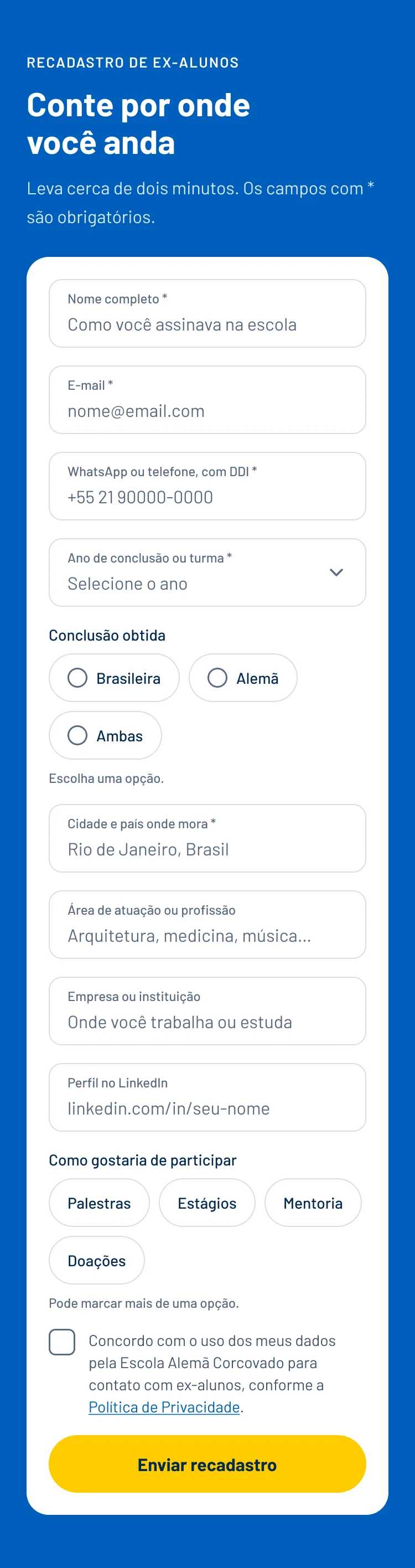
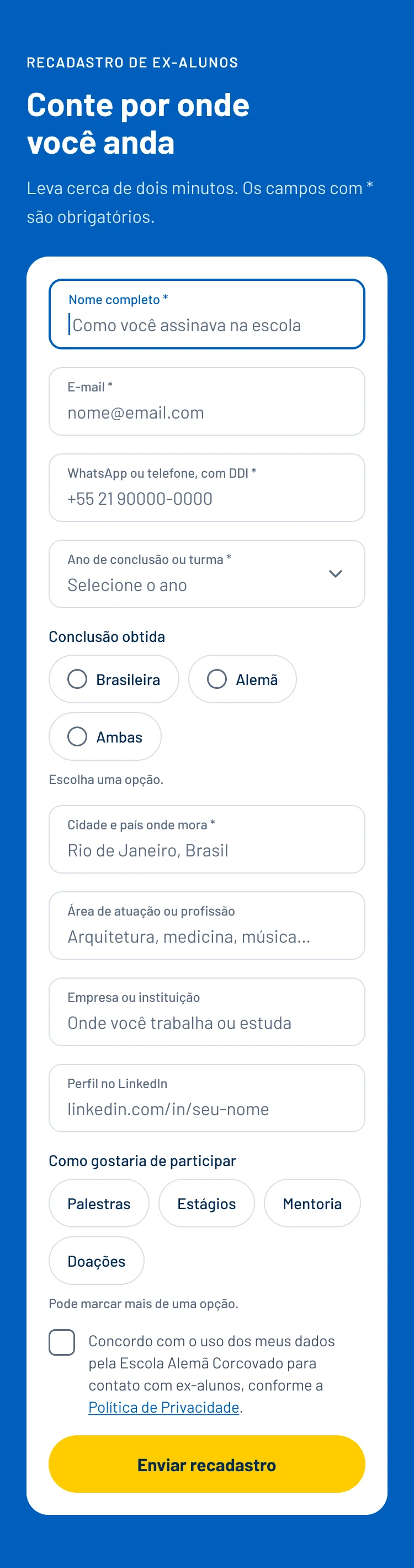
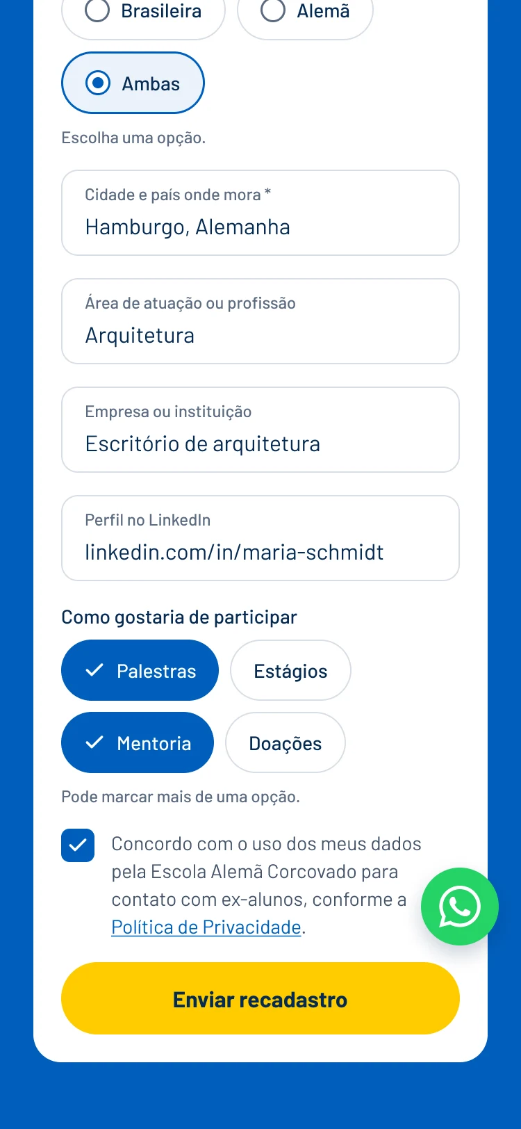
Eight states, every one designed

The form is the heart of the page. Each state was designed so development never has to guess.

The default state, with examples in the fields.

Form: Empty
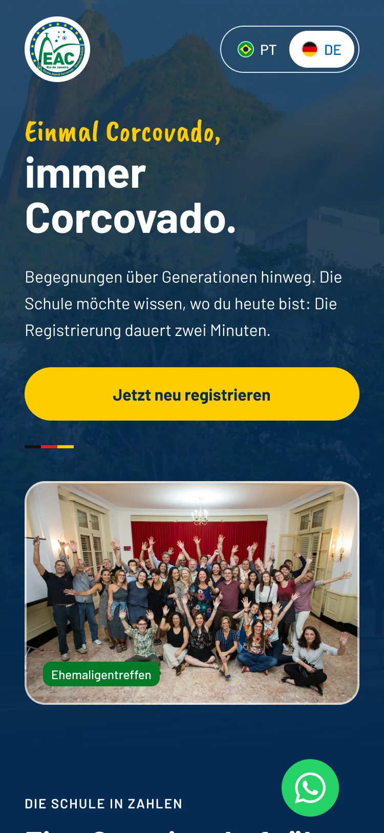
Languages

Two languages, one page

The PT/DE switch changes the whole page. Alumni living in Germany read it in the language they live in today.

PTDE
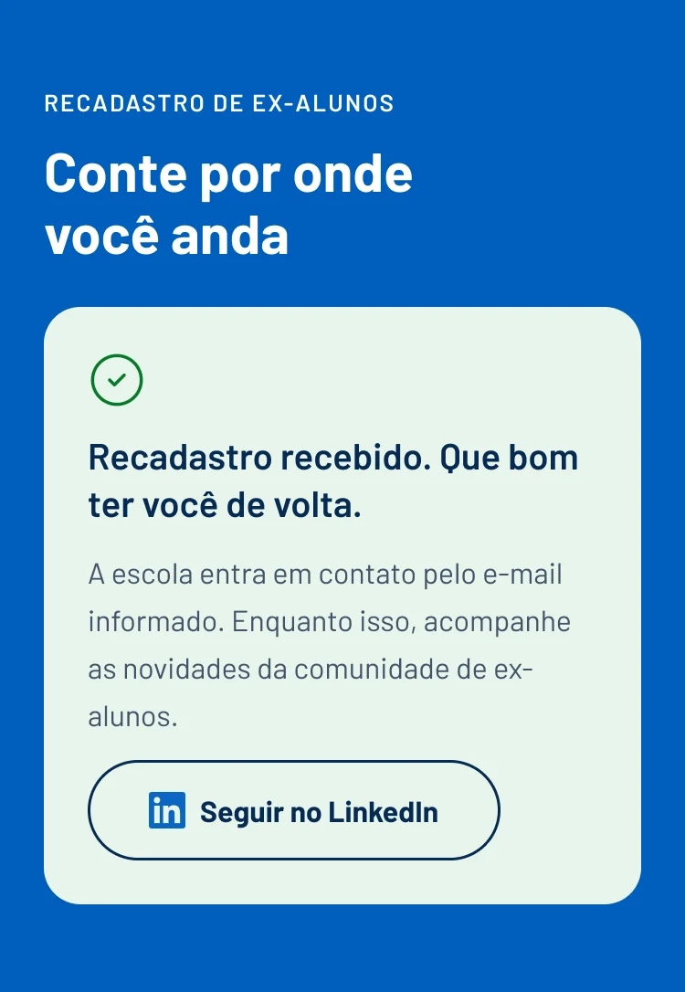
Thank-you page

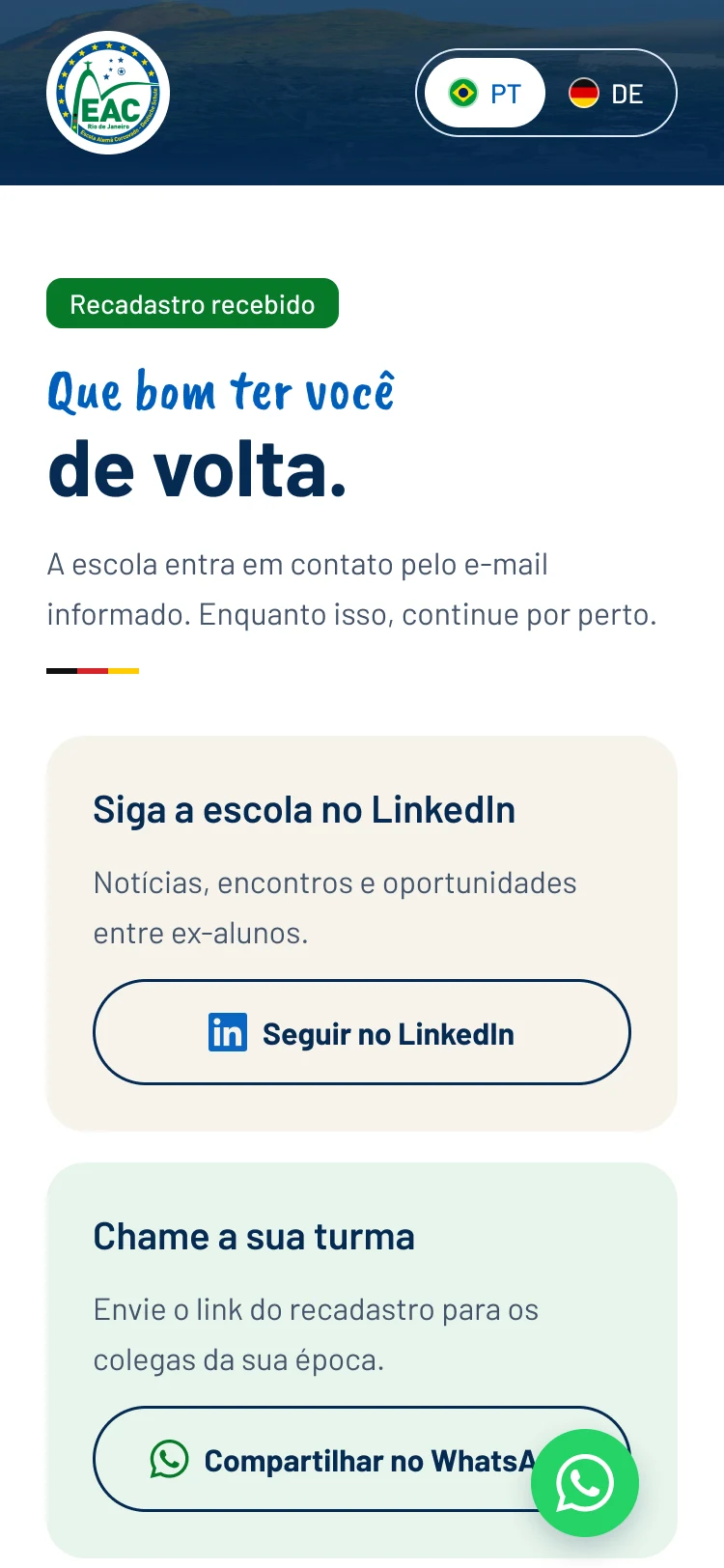
A thank-you that brings the class along

Right after sending, when people are most engaged, the page invites them to follow the school and bring their own class.

A thank-you that brings the class along
Design system

The foundation, before the screens

CSS-named variables, styles and about 20 components with variants, ready for development.

Typography

Uma vez Corcovado,

sempre Corcovado.

Barlow
Bold 70 · SemiBold 32 · Regular 16
Caveat Brush
Regular 40 · 30

Colors

  • color/bg/brand#005EBC
  • color/bg/brand-deep#062A52
  • color/action/primary#FFCC00
  • color/action/primary-hover#F2BE00
  • color/text/success#077A28
  • color/bg/section-green#E7F5EB
  • color/bg/paper#F6F3EC
  • color/bg/brand-subtle#EAF2FB
  • color/text/secondary#44546A
  • color/text/danger#B3261E

Spacing

4812162432486496

Radii

sm8
md12
lg20
full999

Components

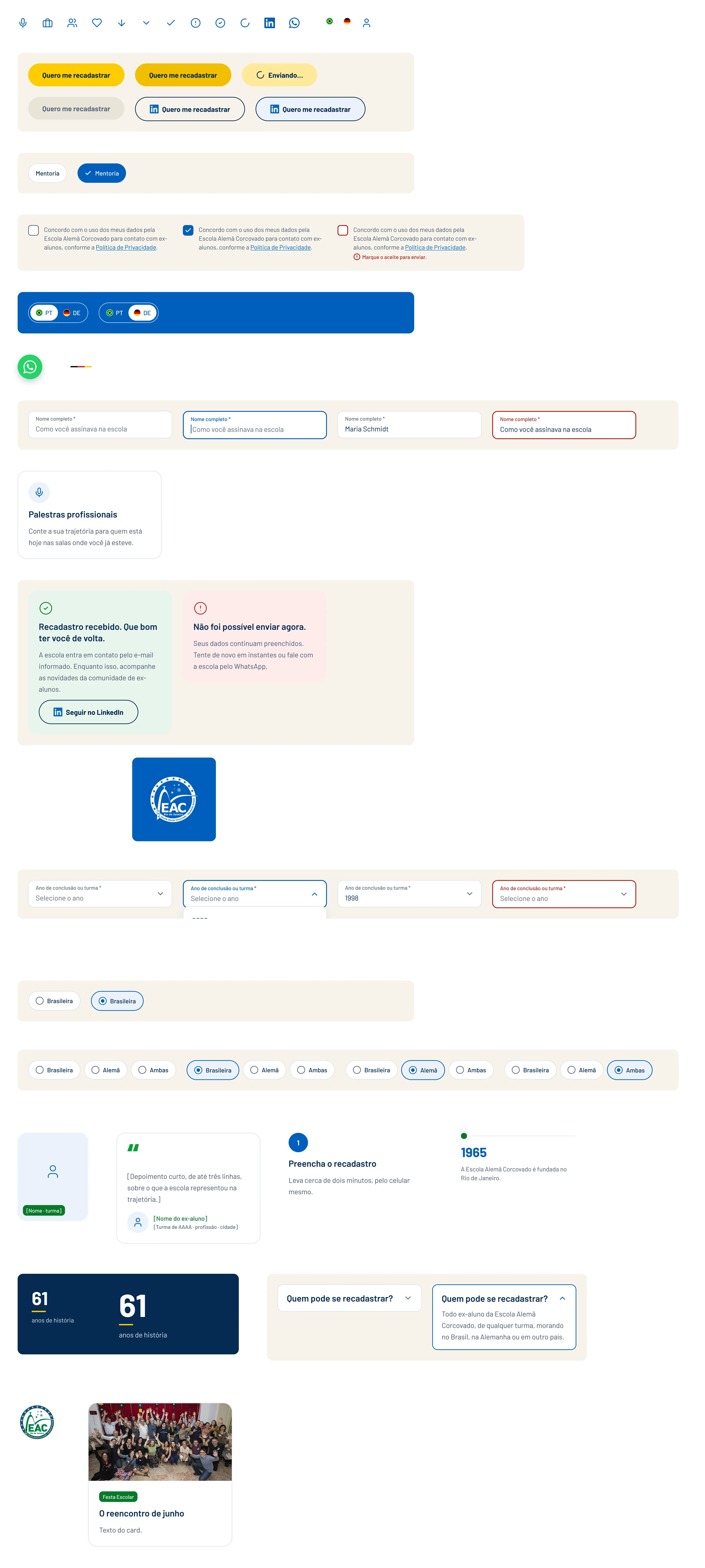
The Figma components page: icons, buttons, chips, consent checkbox, language switch, fields, cards, messages and numbers.

What I did

Interface
Research into the school's site and the client's references, a visual direction validated on a single screen, then mobile first and desktop after. The form got every state, and the clickable prototype behaves like the real page: scrolling to the form, validation, sending, the thank-you page and the language switch.
Design system
A Figma foundation built before the screens: color, spacing and radius variables named after their CSS tokens, text and shadow styles, and about 20 components with variants, such as button, field, select, single choice, chips, consent checkbox, language switch, cards and messages.

Key decisions

  • A single action color: yellow appears only on "Re-register" and "Send".
  • The hero shows people, not buildings: the first image is a real alumni reunion.
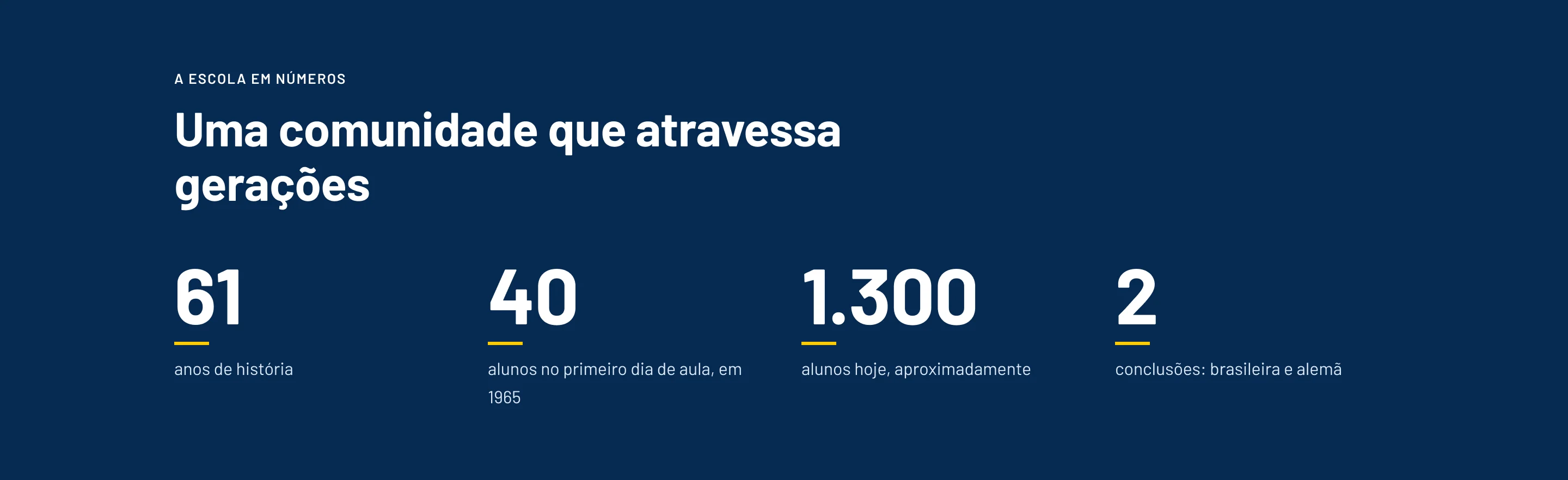
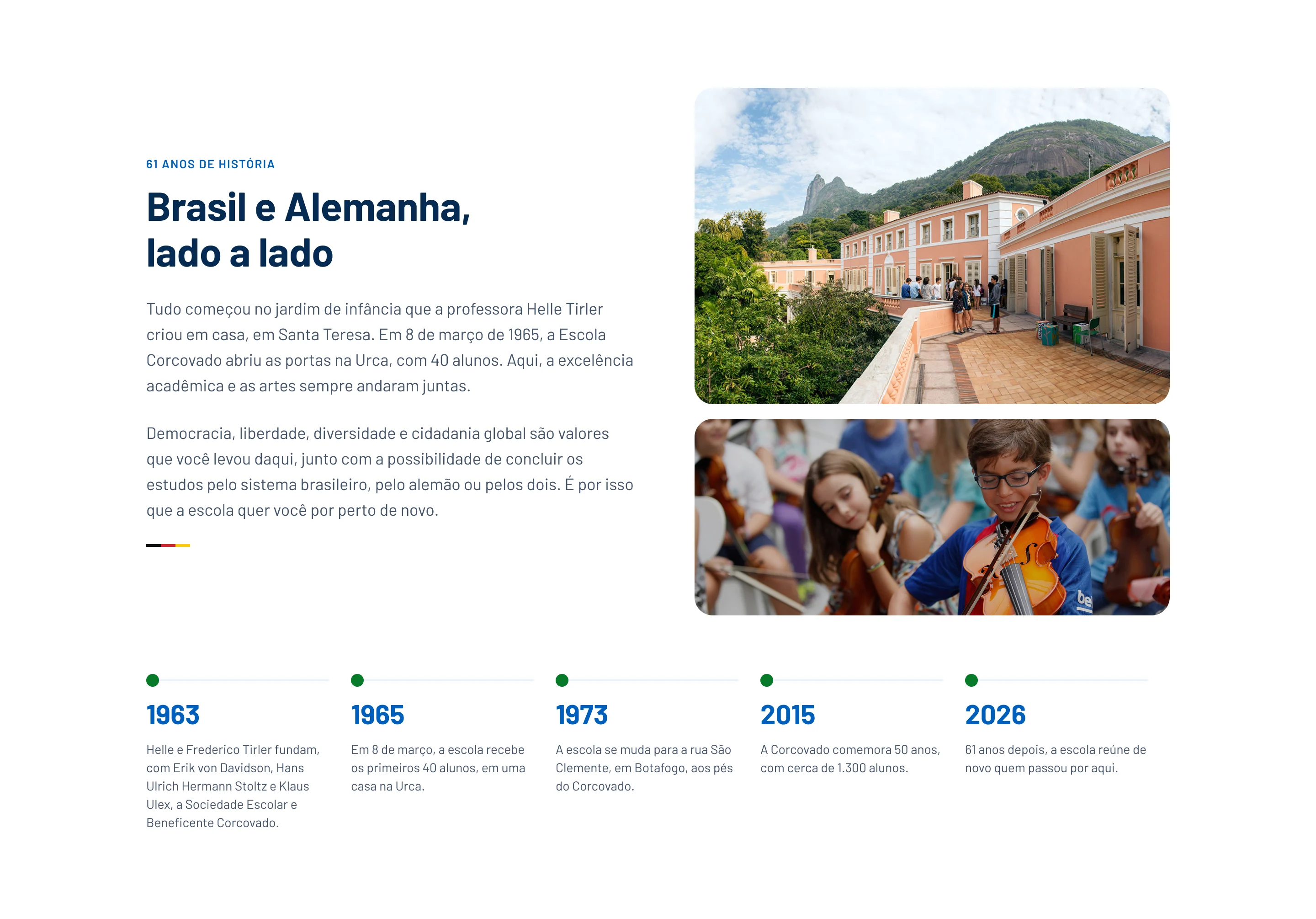
  • Numbers right after the hero and the school's history right before the form, so people reach it with the memory already warm.
  • A genuinely short form: six required fields, the rest optional.
  • Errors that help: each message says what's missing and how to fix it, without losing what was typed.
  • Two real languages: the PT/DE switch changes the whole page.
  • A thank-you page that multiplies: it invites people to follow the school on LinkedIn and bring their class along.

Next project

Project cover: the new IPPES website in a browser and on a phone, with the yellow ipê trees hero, on a burgundy background.

IPPES2026

A digital presence that reflects the value of scientific research.

A project for the Institute for Research, Suicide Prevention and Studies, focused on organizing information, communicating its work, and making institutional content clearer and more accessible.

  • Website design
  • UX/UI
  • Design system