Work

2026

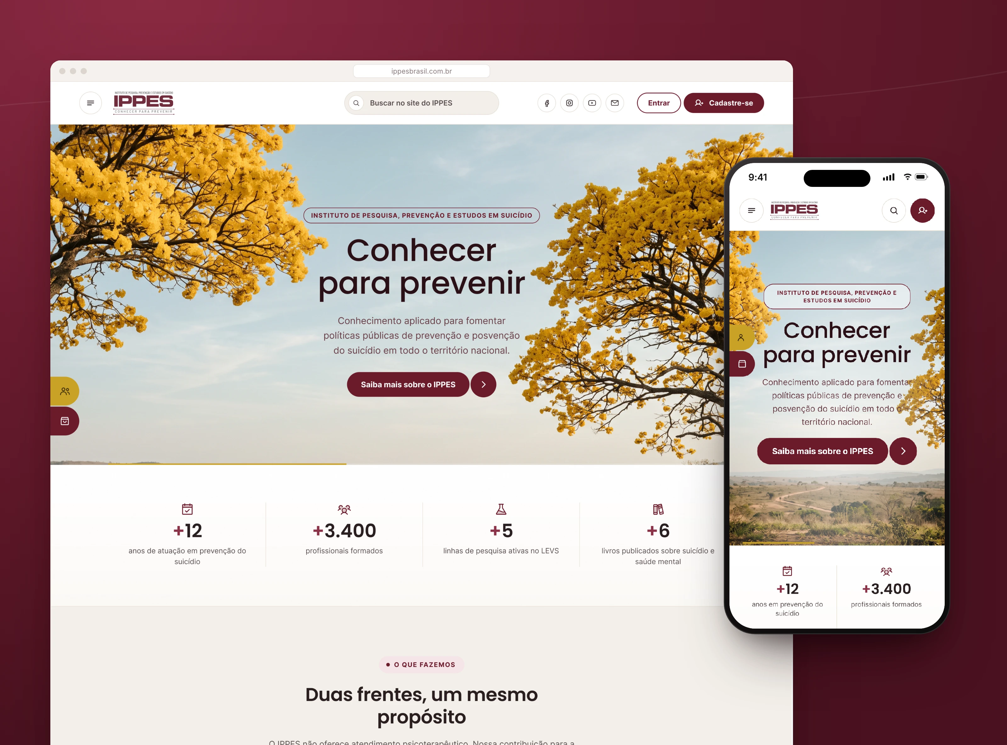
Project cover: the new IPPES website in a browser and on a phone, with the yellow ipê trees hero, on a burgundy background.

IPPES

  • Website design
  • UX/UI
  • Design system

A digital presence that reflects the value of scientific research.

A project for the Institute for Research, Suicide Prevention and Studies, focused on organizing information, communicating its work, and making institutional content clearer and more accessible.

Year
2026
Role
UX/UI Designer
Studio
Estúdio Sync
Deliverables
Interface, design system, and clickable prototype, on desktop and mobile

Context

IPPES is a Brazilian research and training institute focused on suicide prevention and postvention. Its old website had fallen behind: every piece of content carried the same weight, navigation relied on cramped tabs across the top, and the page didn't even have a main heading. Meanwhile, most people sign up for courses on their phones. The project was done with Estúdio Sync, who gathered the requirements and got the wireframe structure approved by the client; my role was to turn that structure into the interface, the visual system, and a clickable prototype.

Challenge

Modernize without leaving the institutional standard behind: the client wanted a current, interactive site that still felt unmistakably like IPPES, in the brand's colors. The site had to organize a lot of long-form academic content, put the flagship training program front and center, give each program its own logo and space, and work well on mobile.

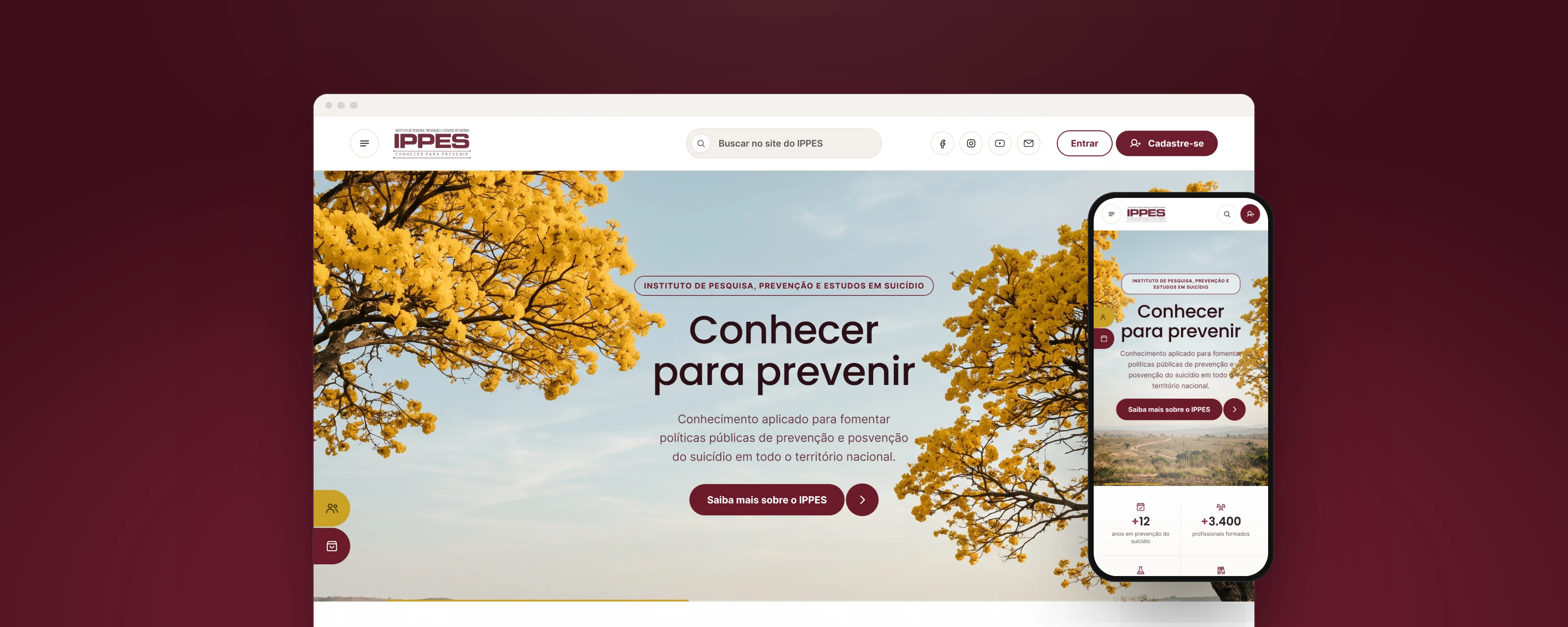
The new home page on desktop, with the ipê trees hero, and the same page on mobile.
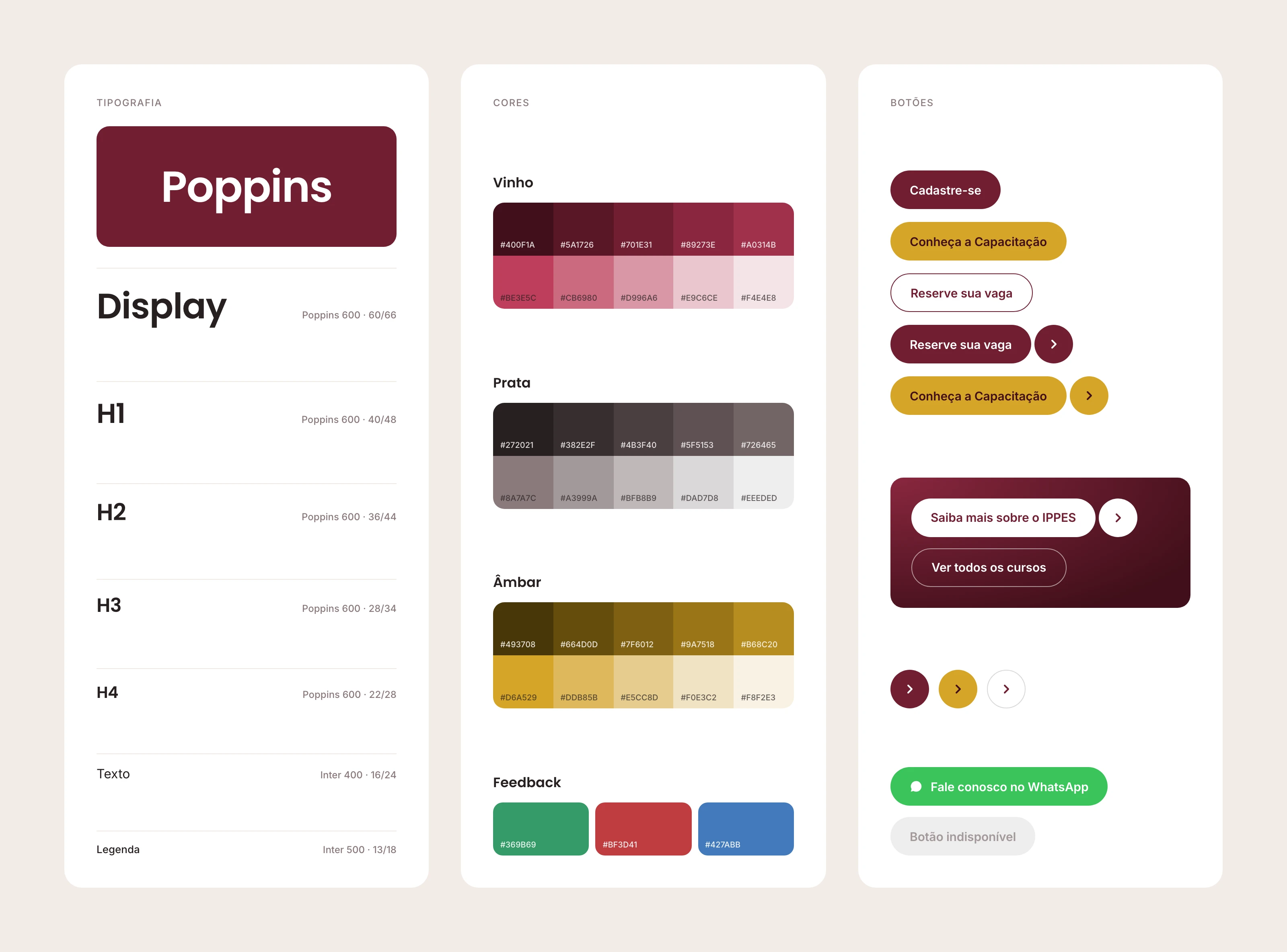
Design system: type scale, color palette, and buttons.
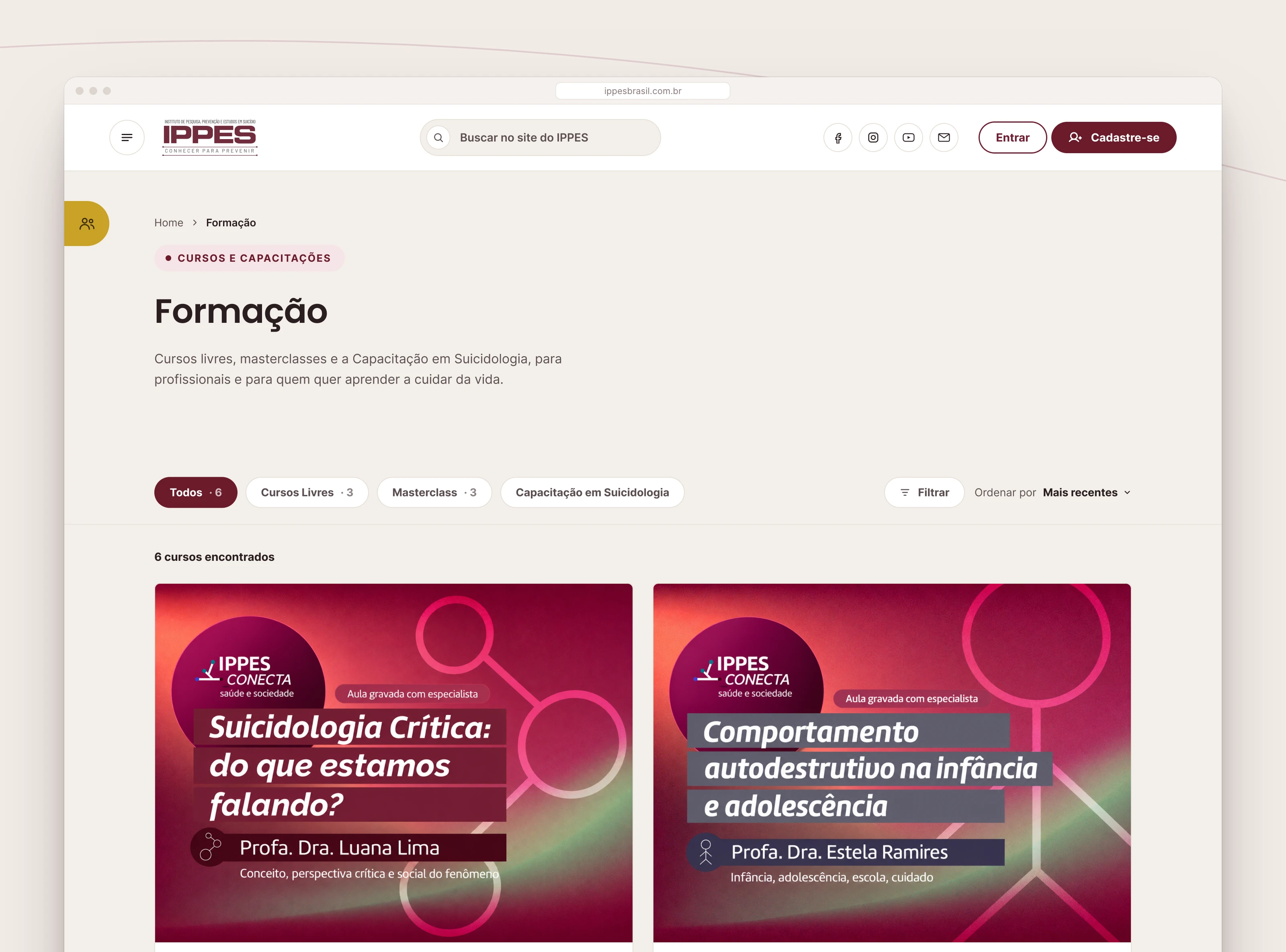
The course listing, with filters and enrollment badges.
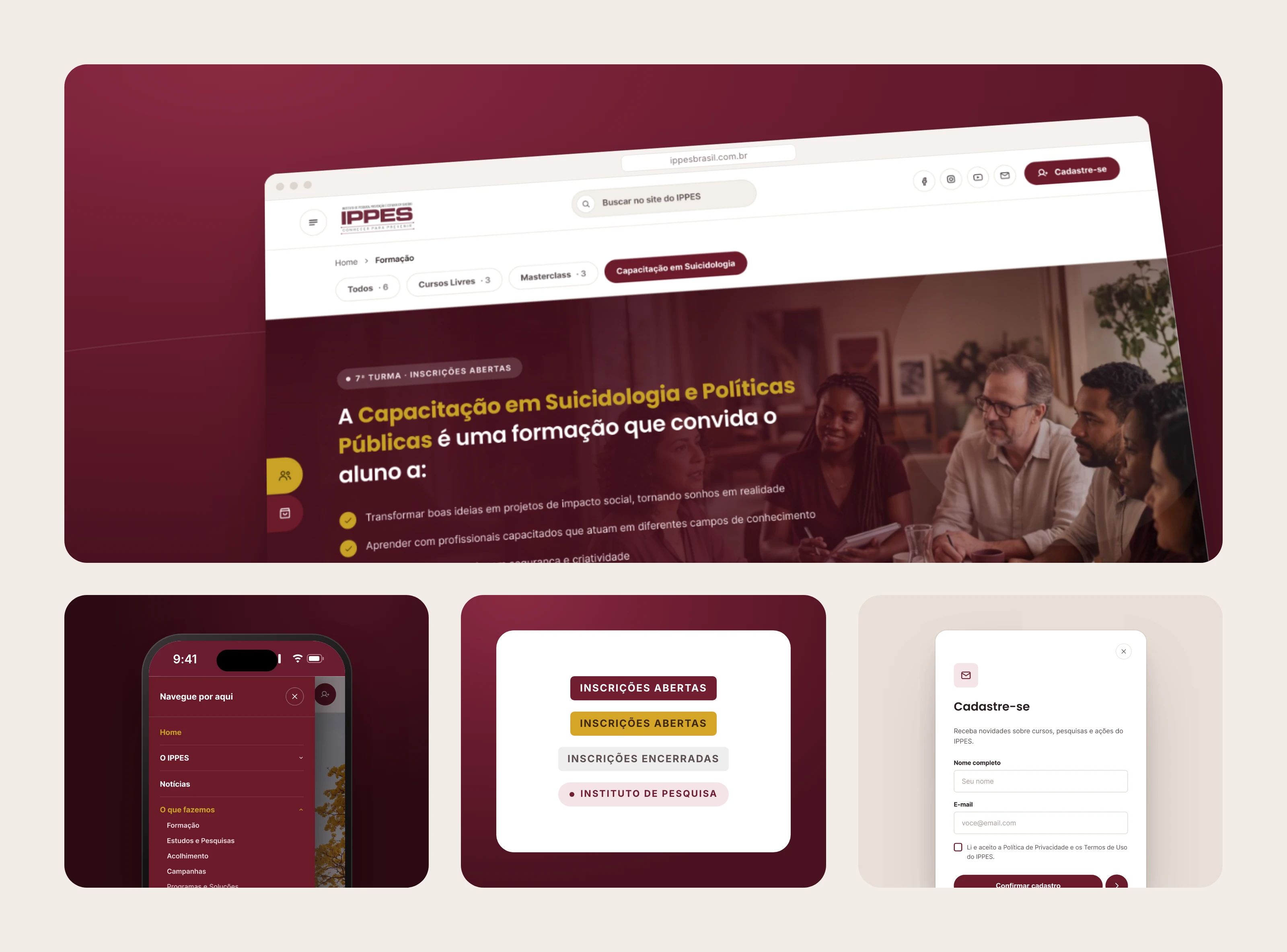
The Training program page in perspective and, below, the mobile side menu, the enrollment status badges, and the sign-up modal.
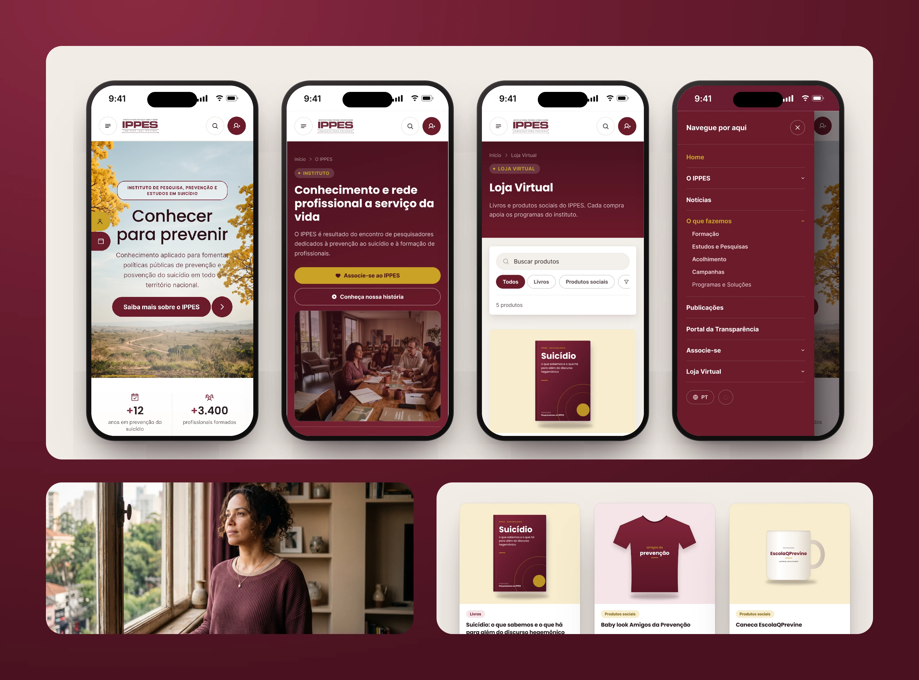
Four mobile screens (home, about, store, and menu), one of the site's photos, and three products from the online store.
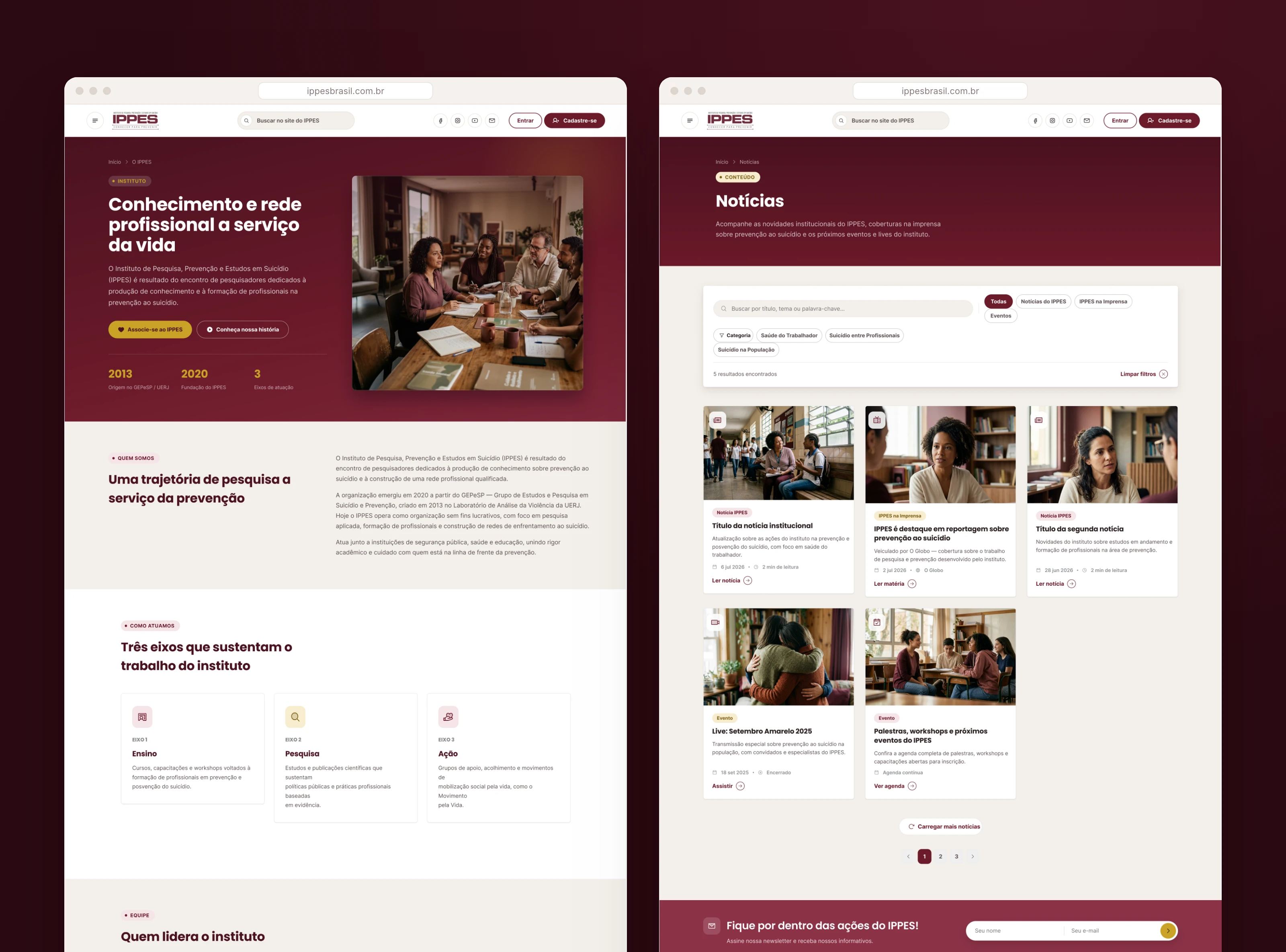
Inner pages: about and the news listing.
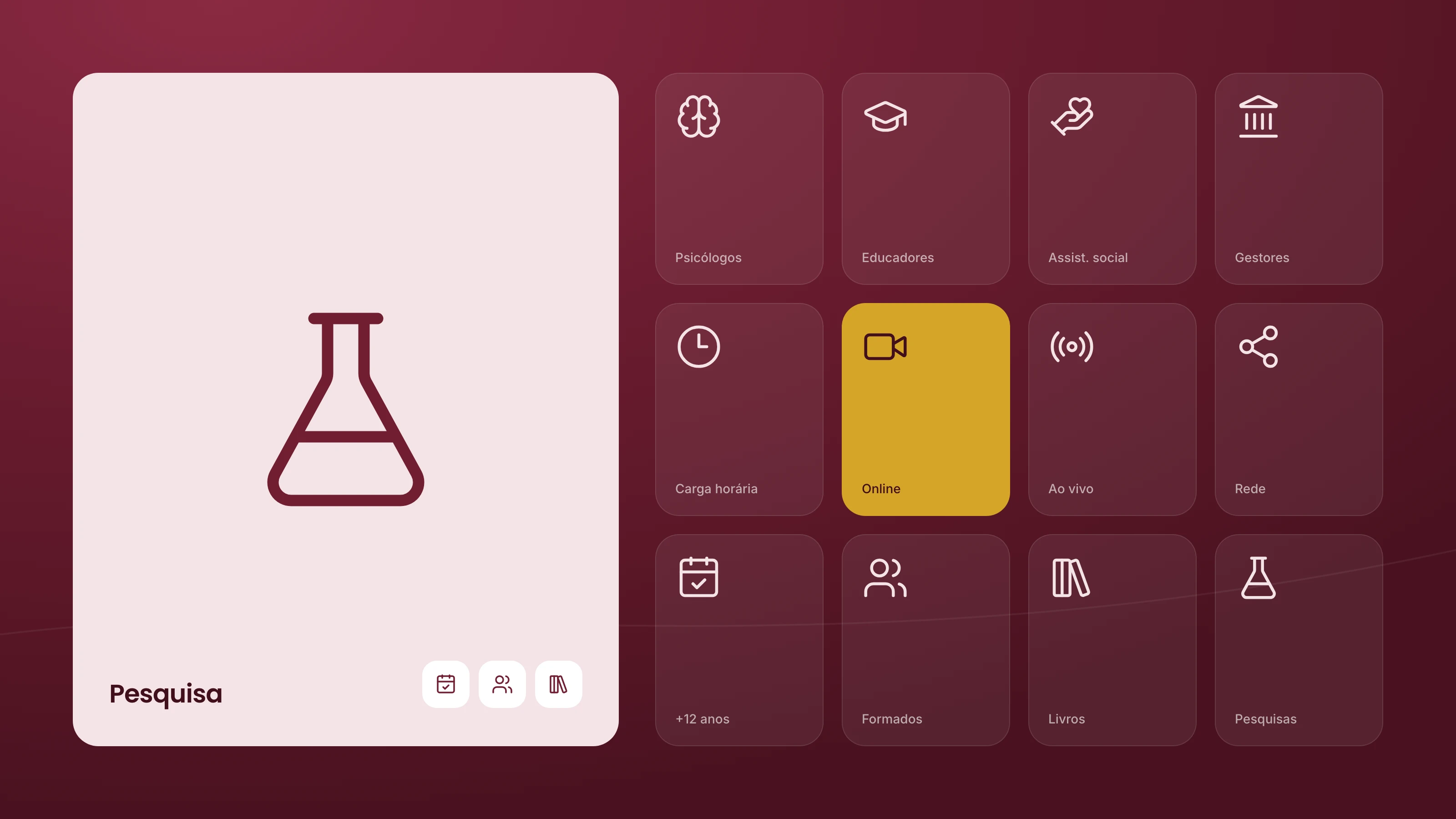
The site's icons up close, with the research flask enlarged and the grid of content icons.

What I did

Interface
Layouts for the main pages (Home, Education, and the Training program) on desktop and mobile, including the side menu, search, sign-up modal, course filters, and enrollment form. In the next round, the inner pages: about, news, programs, and store. All of it connected in a complete clickable prototype, in both formats.
Design system
A defined type scale (Poppins for headings, Inter for body text), a burgundy and silver palette with ten shades each, and the components repeated across the whole site: buttons, badges, chips, course, news, and program cards, form fields, and icons.

Key decisions

  • A sliding side menu instead of the top tabs, with up to three accordion levels, to hold the number of programs and pages.
  • Typographic hierarchy and spacing built for long-form reading, with contrast suited to a broad audience.
  • Components designed as a system, since cards, badges, and buttons repeat on every page.
  • Enrollment status shown as a badge on the course card, replacing the diagonal banner across the cover.
  • A Training program banner on the home page, matching the course page's look, to connect the two.
  • A palette ready for a future dark mode, and space reserved in the header for the English version.

Next project

Sonhe Gramado

A digital experience that inspires people to travel.

A website designed to present the accommodation experience intuitively, showcase the destination, and help visitors find the information they need to plan their stay.
  • Web design
  • UX/UI
  • Development